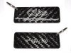
Nice one Steve - the keyrings are looking pretty slick in the images there
Although....
...and i'm ready to be shot down in flames here - dare i say the 'Clio' logo dwarves and overpowers the 'Trophy' logo on the images shown. I think omitting the word Clio and enlarging the size of the Trophy logo might work better - might look cleaner and less cluttered too (and save a few quid). Just my thoughts folks....
I see your point Hoolio - could be. Maybe we could go for a longer thinner piece of carbon fibre then - that would be a bit different?
These arent the official clio trophy ones though Hoolio so were not originally based on the site logo - i believe there is another thread for official clio trophy ones somewhere